
 By Joe Szabo, Scottsdale Real Estate Team
Color can serve many different purposes in decorating; it can make a room feel light and airy, or seem snug and cozy. Here are some different tips to keep in mind when choosing different colors.
First, look at color value. Colors with similar tints (lighter) or shades (darker) will go well together in a room, and help it blend. For instance, a light yellow would go well with a light blue or green, as opposed to darker colors.
Second, in order to keep a room from looking disjointed, it is helpful to write down a desired color scheme for a room. This way, when shopping for that particular room, you can distinguish what to buy according to the main color, secondary color, and the accent colors. When defining this color scheme, it helps to choose a pattern, or perhaps the fabric of a couch to inspire it.
Third, when deciding a color scheme, it is important to give an existing color a reason. For instance, if there is an aspect about a home that can not necessarily be changed any time soon (an unattractive tile in the bathroom); putting more of that color can help. If the tile is an off green, perhaps putting different shades of green can help it blend and look more attractive.
Fourth, pairing up any color and white offers a crisp, clean look. Repeating the chosen color and white through out the room makes it classic looking and easy to decorate, while keeping consistent.
Fifth, color can be used to direct the eye where attention is most wanted. To do this, lighter, more passive colors are used in the background, while brighter color add accent and are used to draw the attention.
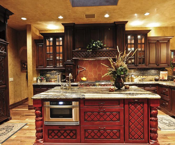
Sixth, sticking to one, basic formula keeps things easy. The three color scheme is often used, where three colors (or shades of color) are picked from a pattern of some sort (a rug, piece of furniture, etc.). About sixty percent of the room is in the main (or lighter) color, thirty percent in the secondary (mid-tone) color, and ten percent in the accent (brightest) color.
Seventh, all colors have a warm or cool undertone. Keep this in mind when deciding on a scheme, because often times colors blend best together when they have the same under tone (i.e. pink and yellow).
Eighth, rug colors can often be the starting point to a room and can be the center of a color scheme. Therefore, accessories that coordinate with this scheme can create a pull into the room.
Ninth, make sure to offset richer colors with light, paler colors in order to make the room mesh and keep the rich colors from overpowering the room. Often rooms with too much color can be overwhelming, and cause absence of a focal point.
Finally, color should always be distributed. If color is placed in just one area of the room it can throw the balance off, and can look as though it was just an afterthought, rather than part of the room. Remember, it is good to try to make the color and pattern of a room flow, and to create a focal point so eyes do not wander aimlessly.
Please note that this Scottsdale Real Estate Blog is for informational purposes and not intended to take the place of a licensed Scottsdale Real Estate Agent. The Szabo Group offers first class real estate services to clients in the Scottsdale Greater Phoenix Metropolitan Area in the buying and selling of Luxury homes in Arizona. Award winning Realtors and Re/MAX top producers and best real estate agent for Luxury Homes in Scottsdale, The Szabo group delivers experience, knowledge, dedication and proven results. Contact Joe Szabo at 480.688.2020, info@ScottsdaleRealEstateTeam.com or visit www.scottsdalerealestateteam.com to find out more about Scottsdale Homes for Sale and Estates for Sale in Scottsdale and to search the Scottsdale MLS for Scottsdale Home Listings.
By Joe Szabo, Scottsdale Real Estate Team
Color can serve many different purposes in decorating; it can make a room feel light and airy, or seem snug and cozy. Here are some different tips to keep in mind when choosing different colors.
First, look at color value. Colors with similar tints (lighter) or shades (darker) will go well together in a room, and help it blend. For instance, a light yellow would go well with a light blue or green, as opposed to darker colors.
Second, in order to keep a room from looking disjointed, it is helpful to write down a desired color scheme for a room. This way, when shopping for that particular room, you can distinguish what to buy according to the main color, secondary color, and the accent colors. When defining this color scheme, it helps to choose a pattern, or perhaps the fabric of a couch to inspire it.
Third, when deciding a color scheme, it is important to give an existing color a reason. For instance, if there is an aspect about a home that can not necessarily be changed any time soon (an unattractive tile in the bathroom); putting more of that color can help. If the tile is an off green, perhaps putting different shades of green can help it blend and look more attractive.
Fourth, pairing up any color and white offers a crisp, clean look. Repeating the chosen color and white through out the room makes it classic looking and easy to decorate, while keeping consistent.
Fifth, color can be used to direct the eye where attention is most wanted. To do this, lighter, more passive colors are used in the background, while brighter color add accent and are used to draw the attention.
Sixth, sticking to one, basic formula keeps things easy. The three color scheme is often used, where three colors (or shades of color) are picked from a pattern of some sort (a rug, piece of furniture, etc.). About sixty percent of the room is in the main (or lighter) color, thirty percent in the secondary (mid-tone) color, and ten percent in the accent (brightest) color.
Seventh, all colors have a warm or cool undertone. Keep this in mind when deciding on a scheme, because often times colors blend best together when they have the same under tone (i.e. pink and yellow).
Eighth, rug colors can often be the starting point to a room and can be the center of a color scheme. Therefore, accessories that coordinate with this scheme can create a pull into the room.
Ninth, make sure to offset richer colors with light, paler colors in order to make the room mesh and keep the rich colors from overpowering the room. Often rooms with too much color can be overwhelming, and cause absence of a focal point.
Finally, color should always be distributed. If color is placed in just one area of the room it can throw the balance off, and can look as though it was just an afterthought, rather than part of the room. Remember, it is good to try to make the color and pattern of a room flow, and to create a focal point so eyes do not wander aimlessly.
Please note that this Scottsdale Real Estate Blog is for informational purposes and not intended to take the place of a licensed Scottsdale Real Estate Agent. The Szabo Group offers first class real estate services to clients in the Scottsdale Greater Phoenix Metropolitan Area in the buying and selling of Luxury homes in Arizona. Award winning Realtors and Re/MAX top producers and best real estate agent for Luxury Homes in Scottsdale, The Szabo group delivers experience, knowledge, dedication and proven results. Contact Joe Szabo at 480.688.2020, info@ScottsdaleRealEstateTeam.com or visit www.scottsdalerealestateteam.com to find out more about Scottsdale Homes for Sale and Estates for Sale in Scottsdale and to search the Scottsdale MLS for Scottsdale Home Listings.
The Use of Color in Decorating the Scottsdale Home by Joe Szabo, Scottsdale Real Estate Team
By Joe Szabo, Scottsdale Real Estate Team
Color can serve many different purposes in decorating; it can make a room feel light and airy, or seem snug and cozy. Here are some different tips to keep in mind when choosing different colors.
First, look at color value. Colors with similar tints (lighter) or shades (darker) will go well together in a room, and help it blend. For instance, a light yellow would go well with a light blue or green, as opposed to darker colors.
Second, in order to keep a room from looking disjointed, it is helpful to write down a desired color scheme for a room. This way, when shopping for that particular room, you can distinguish what to buy according to the main color, secondary color, and the accent colors. When defining this color scheme, it helps to choose a pattern, or perhaps the fabric of a couch to inspire it.
Third, when deciding a color scheme, it is important to give an existing color a reason. For instance, if there is an aspect about a home that can not necessarily be changed any time soon (an unattractive tile in the bathroom); putting more of that color can help. If the tile is an off green, perhaps putting different shades of green can help it blend and look more attractive.
Fourth, pairing up any color and white offers a crisp, clean look. Repeating the chosen color and white through out the room makes it classic looking and easy to decorate, while keeping consistent.
Fifth, color can be used to direct the eye where attention is most wanted. To do this, lighter, more passive colors are used in the background, while brighter color add accent and are used to draw the attention.
Sixth, sticking to one, basic formula keeps things easy. The three color scheme is often used, where three colors (or shades of color) are picked from a pattern of some sort (a rug, piece of furniture, etc.). About sixty percent of the room is in the main (or lighter) color, thirty percent in the secondary (mid-tone) color, and ten percent in the accent (brightest) color.
Seventh, all colors have a warm or cool undertone. Keep this in mind when deciding on a scheme, because often times colors blend best together when they have the same under tone (i.e. pink and yellow).
Eighth, rug colors can often be the starting point to a room and can be the center of a color scheme. Therefore, accessories that coordinate with this scheme can create a pull into the room.
Ninth, make sure to offset richer colors with light, paler colors in order to make the room mesh and keep the rich colors from overpowering the room. Often rooms with too much color can be overwhelming, and cause absence of a focal point.
Finally, color should always be distributed. If color is placed in just one area of the room it can throw the balance off, and can look as though it was just an afterthought, rather than part of the room. Remember, it is good to try to make the color and pattern of a room flow, and to create a focal point so eyes do not wander aimlessly.
Please note that this Scottsdale Real Estate Blog is for informational purposes and not intended to take the place of a licensed Scottsdale Real Estate Agent. The Szabo Group offers first class real estate services to clients in the Scottsdale Greater Phoenix Metropolitan Area in the buying and selling of Luxury homes in Arizona. Award winning Realtors and Re/MAX top producers and best real estate agent for Luxury Homes in Scottsdale, The Szabo group delivers experience, knowledge, dedication and proven results. Contact Joe Szabo at 480.688.2020, info@ScottsdaleRealEstateTeam.com or visit www.scottsdalerealestateteam.com to find out more about Scottsdale Homes for Sale and Estates for Sale in Scottsdale and to search the Scottsdale MLS for Scottsdale Home Listings.
